The Baseball Prospectus article comparing defensive metrics is… strange

TL;DR and by strange I mean a combination of utter nonsense tests on top of the now-expected rigged test.

Baseball Prospectus released a new article grading defensive metrics against each other and declared their FRAA metric the overall winner, even though it’s by far the most primitive defensive stat of the bunch for non-catchers.  Furthermore, they graded FRAA as a huge winner in the outfield and Statcast’s Outs Above Average as a huge winner in the infield.. and graded FRAA as a dumpster fire in the infield and OAA as a dumpster fire in the outfield.  This is all very curious.  We’re going to answer the three questions in the following order:

  1. On their tests, why does OAA rule the infield while FRAA sucks?
  2. On their tests, why does FRAA rule the outfield while OAA sucks?
  3. On their test, why does FRAA come out ahead overall?

First, a summary of the two systems.  OAA ratings try to completely strip out positioning- they’re only a measure of how well the player did, given where the ball was and where the player started.  FRAA effectively treats all balls as having the same difficulty (after dealing with park, handedness, etc).  It assumes that each player should record the league-average X outs per BIP for the given defensive position/situation and gives +/- relative to that number.

A team allowing a million uncatchable base hits won’t affect the OAA at all (not making a literal 0% play doesn’t hurt your rating), but it will tank everybody’s FRAA because it thinks the fielders “should” be making X outs per Y BIPs.  In a similar vein, hitting a million easy balls at a fielder who botches them all will destroy that fielder’s OAA but leave the rest of his teammates unchanged.  It will still tank *everybody’s* FRAA the same as if the balls weren’t catchable.  An average-performing (0 OAA), average-positioned fielder with garbage teammates will get dragged down to a negative FRAA. An average-performing (0 OAA), average-positioned fielder whose pitcher allows a bunch of difficult balls nowhere near him will also get dragged down to a negative FRAA.

So, in abstract terms: On a team level, team OAA=range + conversion and team FRAA = team OAA + positioning-based difficulty relative to average.  On a player level, player OAA= range + conversion and player FRAA = player OAA + positioning + teammate noise.

Now, their methodology.  It is very strange, and I tweeted at them to make sure they meant what they wrote.  They didn’t reply, it fits the results, and any other method of assigning plays would be in-depth enough to warrant a description, so we’re just going to assume this is what they actually did.  For the infield and outfield tests, they’re using the season-long rating each system gave a player to predict whether or not a play resulted in an out.  That may not sound crazy at first blush, but..

…using only the fielder ratings for the position in question, run the same model type position by position to determine how each system predicts the out probability for balls fielded by each position. So, the position 3 test considers only the fielder quality rate of the first baseman on *balls fielded by first basemen*, and so on.

Their position-by-position comparisons ONLY INVOLVE BALLS THAT THE PLAYER ACTUALLY FIELDED.  A ground ball right through the legs untouched does not count as a play for that fielder in their test (they treat it as a play for whoever picks it up in the outfield).  Obviously, by any sane measure of defense, that’s a botched play by the defender, which means the position-by-position tests they’re running are not sane tests of defense.  They’re tests of something else entirely, and that’s why they get the results that they do.

Using the bolded abstraction above, this is only a test of conversion.  Every play that the player didn’t/couldn’t field IS NOT INCLUDED IN THE TEST.  Since OAA adds the “noise” of range to conversion, and FRAA adds the noise of range PLUS the noise of positioning PLUS the noise from other teammates to conversion, OAA is less noisy and wins and FRAA is more noisy and sucks.  UZR, which strips out some of the positioning noise based on ball location, comes out in the middle.  The infield turned out to be pretty easy to explain.

The outfield is a bit trickier.  Again, because ground balls that got through the infield are included in the OF test (because they were eventually fielded by an outfielder), the OF test is also not a sane test of defense.  Unlike the infield, when the outfield doesn’t catch a ball, it’s still (usually) eventually fielded by an outfielder, and roughly on average by the same outfielder who didn’t catch it.

So using the abstraction, their OF test measures range + conversion + positioning + missed ground balls (that roll through to the OF).  OAA has range and conversion.  FRAA has range, conversion, positioning, and some part of missed ground balls through the teammate noise effect described earlier.  FRAA wins and OAA gets dumpstered on this silly test, and again it’s not that hard to see why, not that it actually means much of anything.


Before talking about the teamwide defense test, it’s important to define what “defense” actually means (for positions 3-9).  If a batter hits a line drive 50 feet from anybody, say a rope safely over the 3B’s head down the line, is it bad defense by 3-9 that it went for a hit?  Clearly not, by the common usage of the word. Who would it be bad defense by?  Nobody could have caught it.  Nobody should have been positioned there.

BP implicitly takes a different approach

So, recognizing that defenses are, in the end, a system of players, we think an important measure of defensive metric quality is this: taking all balls in play that remained in the park for an entire season — over 100,000 of them in 2019 — which system on average most accurately measures whether an out is probable on a given play? This, ultimately, is what matters.  Either you get more hitters out on balls in play or you do not. The better that a system can anticipate that a batter will be out, the better the system is.

that does consider this bad defense.  It’s kind of amazing (and by amazing I mean not the least bit surprising at this point) that every “questionable” definition and test is always for the benefit one of BP’s stats.  Neither OAA, nor any of the other non-FRAA stats mentioned, are based on outs/BIP or trying to explain outs/BIP.  In fact, they’re specifically designed to do the exact opposite of that.  The analytical community has spent decades making sure that uncatchable balls don’t negatively affect PLAYER defensive ratings, and more generally to give an appropriate amount of credit to the PLAYER based on the system’s estimate of the difficulty of the play (remember from earlier that FRAA doesn’t- it treats EVERY BIP as average difficulty).

The second “questionable” decision is to test against outs/BIP.  Using abstract language again to break this down, outs/BIP = player performance given the difficulty of the opportunity + difficulty of opportunity.  The last term can be further broken down into difficulty of opportunity = smart/dumb fielder positioning + quality of contact allowed (a pitcher who allows an excess of 100mph batted balls is going to make it harder for his defense to get outs, etc) + luck.  In aggregate:

outs/BIP=

player performance given the difficulty of the opportunity (OAA) +

smart/dumb fielder positioning (a front-office/manager skill in 2019) +

quality of contact allowed (a batter/pitcher skill) +

luck (not a skill).

That’s testing against a lot of nonsense beyond fielder skill, and it’s testing against nonsense *that the other systems were explicitly designed to exclude*.  It would take the creators of the other defensive systems less time than it took me to write the previous paragraph to run a query and report an average difficulty of opportunity metric when the player was on the field (their systems are all already designed around giving every BIP a difficulty of opportunity score), but again, they don’t do that because *they’re not trying to explain outs/BIP*.

The third “questionable” decision is to use 2019 ratings to predict 2019 outs/BIP.  Because observed OAA is skill+luck, it benefits from “knowing” the luck in the plays it’s trying to predict.  In this case, luck being whether a fielder converted plays at/above/below his true skill level.  2019 FRAA has all of the difficulty of opportunity information baked in for 2019 balls, INCLUDING all of the luck in difficulty of opportunity ON TOP OF the luck in conversion that OAA also has.

All of that luck is just noise in reality, but because BP is testing the rating against THE SAME PLAYS used to create the rating, that noise is actually signal in this test, and the more of it included, the better.  That’s why FRAA “wins” handily.  One could say that this test design is almost maximally disingenuous, and of course it’s for the benefit of BP’s in-house stat, because that’s how they roll.

Dave Stieb was good

Since there’s nothing of any interest going on in the country or the world today, I decided the time was right to defend the honour of a Toronto pitcher from the 80s.  Looking deeper into this article, https://www.baseballprospectus.com/news/article/57310/rubbing-mud-dra-and-dave-stieb/ which concluded that Stieb was actually average or worse rate-wise, many of the assertions are… strange.

First, there’s the repeated assertion that Stieb’s K and BB rates are bad.  They’re not.  He pitched to basically dead average defensive catchers, and weighted by the years Stieb pitched, he’s actually marginally above the AL average.  The one place where he’s subpar, hitting too many batters, isn’t even mentioned.  This adds up to a profile of

K/9 BB/9 HBP/9
AL Average 5.22 3.28 0.20
Stieb 5.19 3.21 0.40

Accounting for the extra HBPs, these components account for about 0.05 additional ERA over league average, or ~1%.  Without looking at batted balls at all, Stieb would only be 1% worse than average (AL and NL are pretty close pitcher-quality wise over this timeframe, with the AL having a tiny lead if anything).  BP’s version of FIP- (cFIP) has Stieb at 104.  That doesn’t really make any sense before looking at batted balls, and Stieb only allowed a HR/9 of 0.70 vs. a league average of 0.88.  He suppressed home runs by 20%- in a slight HR-friendly park- over 2900 innings, combined with an almost dead average K/BB profile, and BP rates his FIP as below average.  That is completely insane.

The second assertion is that Stieb relied too much on his defense.  We can see from above that an almost exactly average percentage of his PAs ended with balls in play, so that part falls flat, and while Toronto did have a slightly above-average defense, it was only SLIGHTLY above average.  Using BP’s own FRAA numbers, Jays fielders were only 236 runs above average from 79-92, and prorating for Stieb’s share of IP, they saved him 24 runs, or a 0.08 lower ERA (sure, it’s likely that they played a bit better behind him and a bit worse behind everybody else).  Stieb’s actual ERA was 3.44 and his DRA is 4.43- almost one full run worse- and the defense was only a small part of that difference.  Even starting from Stieb’s FIP of 3.82, there’s a hell of a long way to go to get up to 4.43, and a slightly good defense isn’t anywhere near enough to do it.

Stieb had a career BABIP against of .260 vs. AL average of .282, and the other pitchers on his teams had an aggregate BABIP of .278.  That’s more evidence of a slightly above-average defense, suppressing BABIP a little in a slight hitter’s home park, but Stieb’s BABIP suppression goes far beyond what the defense did for everybody else.  It’s thousands-to-1 against a league-average pitcher suppressing HR as much as Stieb did.  It’s also thousands-to-1 against a league-average pitcher in front of Toronto’s defense suppressing BABIP as much as Stieb did.  It’s exceptionally likely that Stieb actually was a true-talent soft contact machine.  Maybe not literally to his careen numbers, but the best estimate is a hell of a lot closer to career numbers than to average after 12,000 batters faced.

This is kind of DRA and DRC in a microcosm.  It can spit out values that make absolutely no sense at a quick glance, like a league-average K/BB guy with great HR suppression numbers grading out with a below-average cFIP, and it struggles to accept outlier performance on balls in play, even over gigantic samples, because the season-by-season construction is completely unfit for purpose when used to describe a career.  That’s literally the first thing I wrote when DRC+ was rolled out, and it’s still true here.

Reliever Sequencing, Real or Not?

I read this first article on reliever sequencing, and it seemed like a reasonable enough hypothesis, that batters would do better seeing pitches come from the same place and do worse seeing them come from somewhere else, but the article didn’t discuss the simplest variable that should have a big impact- does it screw batters up to face a lefty after a righty or does it really not matter much at all?  I don’t have their arm slot data, and I don’t know what their exact methodology was, so I just designed my own little study to measure the handedness switch impact.

Using PAs from 2015-18 where the batter is facing a different pitcher than the previous PA in this game (this excludes the first PA in the game for all batters, of course), I noted the handedness of the pitcher, the stance of the batter, and the standard wOBA result of the PA.  To determine the impact of the handedness switch, I compared pairs of data: (RHB vs RHP where the previous pitcher was a LHP) to (RHB vs RHP where the previous pitcher was a RHP), etc, which also controls for platoon effects without having to try to quantify them everywhere.  The raw data is

Table 1

Bats Throws Prev P wOBA N
L L L 0.302 16162
L L R 0.296 54160
L R R 0.329 137190
L R L 0.333 58959
R L L 0.339 19612
R L R 0.337 63733
R R R 0.315 191871
R R L 0.313 82190

which looks fairly minor, and the differences (following same hand – following opposite hand) come out to

Table 2

Bats Throws wOBA Diff SD Harmonic mean of N
L L 0.006 0.0045 24895
L R -0.0046 0.0025 82474
R L 0.002 0.0041 29994
R R 0.002 0.0021 115083
Total Total 0.000000752 252446

which is in the noise range in every bucket and overall no difference between same and opposite hand as the previous pitcher.  Just in case there was miraculously a player-quality effect exactly offsetting a real handedness effect, for each PA in the 8 groups in table 1, I calculated the overall (all 4 years) batter performance against the pitcher’s handedness and the pitcher’s overall performance against batters of that stance, then compared the quality of the group that followed same-handed pitching to the group that followed opposite-handed pitching.

As it turned out there was an effect… quality effects offset some of the observed differential in 3 of the buckets, and now the difference in every individual bucket is less than 1 SD away from 0.000 while the overall effect is still nonexistent.

Table 3

Bats Throws wOBA Diff Q diff Adj Diff SD Harmonic mean of N
L L 0.0057 0.0037 0.0020 0.0045 24895
L R -0.0046 -0.0038 -0.0008 0.0025 82474
R L 0.0018 -0.0022 0.0040 0.0041 29994
R R 0.0016 0.0033 -0.0017 0.0021 115083
Total Total 0 0.0004 -0.0004 252446

Q Diff means that LHP + LHB following a LHP were a combination of better batters/worse pitchers by 3.7 points of wOBA compared to LHP + LHB following a RHP, etc.  So of the observed 5.7 points of wOBA difference, 3.7 of it was expected from player quality and the 2 points left over is the adjusted difference.

I also looked at only the performance against the second pitcher the batter faced in the game using the first pitcher’s handedness, but in that case, following the same-handed pitcher actually LOWERED adjusted performance by 1.7 points of wOBA (third and subsequent pitcher faced was a 1 point benefit for samehandedness), but these are still nothing.  I just don’t see anything here.  If changing pitcher characteristics made a meaningful difference, it would almost have to show up in flipped handedness, and it just doesn’t.

Update:

There was one other obvious thing to check, velocity, and it does show the makings of a real (and potentially somewhat actionable) effect.  Bucketing pitchers into fast (average fastball velocity>94.5, slow <89.5, or medium and doing the same quality/handedness controls as above gave the following:

first reliever starter Quality-adjusted woba SD N
F F 0.319 0.0047 11545
F M 0.311 0.0019 65925
F S 0.306 0.0037 17898
M F 0.318 0.0033 23476
M M 0.321 0.0012 167328
M S 0.320 0.0022 50625
S F 0.321 0.0074 4558
S M 0.318 0.0025 39208
S S 0.330 0.0043 13262

Harder-throwing relievers do better, which isn’t a surprise, but it looks like there’s extra advantage when the starter was especially soft-tossing, and at the other end, slow-throwing relievers are max punished immediately following soft-tossing starters.  This deserves a more in-depth look with more granular tools than aggregate PA wOBA, but two independent groups both showing a >1SD effect in the hypothesized direction is.. something, at least, and an effect size on the order of .2-.3 RA/9 isn’t useless if it holds up.  I’m intrigued again.

The Independent Chip Model of Politics and HoF Voting

I’d talked about the Bill James presidential polls before, and he’s running a similar set of polls for HoF candidates that have a similar kind of issue.  For whatever reason, this time around I realized that his assumptions are the same as the Independent Chip Model (ICM) for poker tournament equity based on stack sizes.  If you aren’t familiar with that, then assume we have 4 players, A with 40 chips, B with 30, C with 20, and D with 10.  Everything else being equal, A should win 40% of the time.  The ICM goes further than that, and for predicting the probability of second place, uses calculations of the form

Assuming A wins, what are the odds B gets second:  Remove A’s chips, and then B has 30/(30+20+10)=50% of the remaining chips, so B is 50% to get second *assuming A wins*.

If you don’t see the analogy yet, the ICM takes as input the stack sizes, which are identical to the probability of finishing first, and uses the first-place percentages to calculate the results of every poll subset.  Bill James runs polls and uses the (first-place) percentages to calculate every head to head subset.  The ICM assumption that to calculate the result between B/C/D, you just ignore A’s chips, is equivalent to the Bill James assumption that A’s support, if A is not an option, will break evenly among B/C/D based on their poll percentage.

That assumption doesn’t hold in politics, for reasons discussed before, and it doesn’t hold for HoF voting because different people prefer different player types even beyond the roid/no roid dichotomy.  As it stands, in the linked poll, Beltre would almost certainly be the leader in 4th-place rankings with ~70% 4th place votes and an average finishing position near or even above 3.0.  He’d likely get stomped in every head-to-head matchup, lose the overall rating, etc, but by using only first-place%, he looks like the clear second-preferred candidate, which is obviously very, very wrong.

It could have gotten even worse if Bonds didn’t dominate the roid vote.  Let’s say we had a different poll, Beltre 30%, Generic Roidmonster 1 (23.33%), Generic Roidmonster 2 (23.33%), Generic Roidmonster 3 (23.33%) where (if people ranked 1-4) the Roidmonsters were ranked randomly 1-3 or 2-4 depending on whether or not the voter was a never-roider or not.  In this case, each Roidmonster would have an average finishing position of 2.3 (Beltre 3.1) and would win the head-to-head with Beltre 70-30… yet Beltre wins the poll only counting first-place votes.

It’s clear that the ICM/James assumptions are violated, and violated to where they’re nowhere close to reality, in polls like this. In the same poll without Bonds, the Bonds votes would go overwhelmingly to Clemens and A-Rod, even though ICM/James assume a majority would go to Beltre. Aggregating sets of votes is going to keep a lot of the same problems because the vote share of any two people in a poll is (well, can be) strongly dependent upon who else is in the poll.  The ICM/James model are built on the assumption of independence there, but it’s clearly not close to true in HoF voting or in politics.

Trust the barrels

Inspired by the curious case of Harrison Bader

baderbarrels

whose average exit velocity is horrific, hard hit% is average, and barrel/contact% is great (not shown, but a little better than the xwOBA marker), I decided to look at which one of these metrics was more predictive.  Barrels are significantly more descriptive of current-season wOBAcon (wOBA on batted balls/contact), and average exit velocity is sketchy because the returns on harder-hit balls are strongly nonlinear. The game rewards hitting the crap out of the ball, and one rocket and one trash ball come out a lot better than two average balls.

Using consecutive seasons with at least 150 batted balls (there’s some survivor bias based on quality of contact, but it’s pretty much even across all three measures), which gave 763 season pairs, barrel/contact% led the way with r=0.58 to next season’s wOBAcon, followed by hard-hit% at r=0.53 and average exit velocity at r=0.49.  That’s not a huge win, but it is a win, but since these are three ways of measuring a similar thing (quality of contact), they’re likely to be highly correlated, and we can do a little more work to figure out where the information lies.

evvehardhit

I split the sample into tenths based on average exit velocity rank, and Hard-hit% and average exit velocity track an almost perfect line at the group (76-77 player) level.  Barrels deviate from linearity pretty measurably with the outliers on either end, so I interpolated and extrapolated on the edges to get an “expected” barrel% based on the average exit velocity, and then I looked at how players who overperformed and underperformed their expected barrel% by more than 1 SD (of the barrel% residual) did with next season’s wOBAcon.

Avg EV decile >2.65% more barrels than expected average-ish barrels >2.65% fewer barrels than expected whole group
0 0.362 0.334 none 0.338
1 0.416 0.356 0.334 0.360
2 0.390 0.377 0.357 0.376
3 0.405 0.386 0.375 0.388
4 0.389 0.383 0.380 0.384
5 0.403 0.389 0.374 0.389
6 0.443 0.396 0.367 0.402
7 0.434 0.396 0.373 0.401
8 0.430 0.410 0.373 0.405
9 0.494 0.428 0.419 0.441

That’s.. a gigantic effect.  Knowing barrel/contact% provides a HUGE amount of information on top of average exit velocity going forward to the next season.  I also looked at year-to-year changes in non-contact wOBA (K/BB/HBP) for these groups just to make sure and it’s pretty close to noise, no real trend and nothing close to this size.

It’s also possible to look at this in the opposite direction- find the expected average exit velocity based on the barrel%, then look at players who hit the ball more than 1 SD (of the average EV residual) harder or softer than they “should” have and see how much that tells us.

Barrel% decile >1.65 mph faster than expected average-ish EV >1.65 mph slower than expected whole group
0 0.358 0.339 0.342 0.344
1 0.362 0.359 0.316 0.354
2 0.366 0.364 0.361 0.364
3 0.389 0.377 0.378 0.379
4 0.397 0.381 0.376 0.384
5 0.388 0.395 0.418 0.397
6 0.429 0.400 0.382 0.403
7 0.394 0.398 0.401 0.398
8 0.432 0.414 0.409 0.417
9 0.449 0.451 0.446 0.450


There’s still some information there, but while the average difference between the good and bad EV groups here is 12 points of next season’s wOBAcon, the average difference for good and bad barrel groups was 50 points.  Knowing barrels on top of average EV tells you a lot.  Knowing average EV on top of barrels tells you a little.

Back to Bader himself, a month of elite barreling doesn’t mean he’s going to keep smashing balls like Stanton or anything silly, and trying to project him based on contact quality so far is way beyond the scope of this post, but if you have to be high on one and low on the other, lots of barrels and a bad average EV is definitely the way to go, both for YTD and expected future production.


Uncertainty in baseball stats (and why DRC+ SD is a category error)

What does it mean to talk about the uncertainty in, say, a pitcher’s ERA or a hitter’s OBP?  You know exactly how many ER were allowed, exactly how many innings were pitched, exactly how many times the batter reached base, and exactly how many PAs he had.  Outside of MLB deciding to retroactively flip a hit/error decision, there is no uncertainty in the value of the stat.  It’s an exact measurement.  Likewise, there’s no uncertainty in Trout’s 2013 wOBA or wRC+.  They reflect things that happened, calculated in deterministic fashion from exact inputs.  Reporting a measurement uncertainty for any of these wouldn’t make any sense.

The Statcast metrics are a little different- EV, LA, sprint speed, hit distance, etc. all have a small amount of random error in each measurement, but since those errors are small and opportunities are numerous, the impact of random error is small to start with and totally meaningless quickly when aggregating measurements.  There’s no point in reporting random measurement uncertainty in a public-facing way because it may as well be 0 (checking for systematic bias is another story, but that’s done with the intent of being fixed/corrected for, not of being reported as metric uncertainty).

Point 1:

So we can’t be talking about the uncertainties in measuring/calculating these kinds of metrics- they’re irrelevant-to-nonexistent.  When we’re talking about the uncertainty in somebody’s ERA or OBP or wRC+, we’re talking about the uncertainty of the player’s skill at the metric in question, not the uncertainty of the player’s observed value.  That alone makes it silly to report such metrics as “observed value +/- something”, like ERA 0.37 +/- 3.95, because it’s implicitly treating the observed value as some kind of meaningful central-ish point in the player’s talent distribution.  There’s no reason for that to be true *because these aren’t talent metrics*.  They’re simply a measure of something over a sample, and many such metrics frequently give values where a better true talent is astronomically unlikely to be correct (a wRC+ over 300) or even impossible (an ERA below 0) and many less extreme but equally silly examples as well.

Point 2:

Expressing something non-stupidly in the A +/- B format (or listing percentiles if it’s significantly non-normal, whatever) requires a knowledge of the player’s talent distribution after the observed performance, and that can’t be derived solely from the player’s data.  If something happens 25% of the time, talent could cluster near 15% and the player is doing it more often, talent could cluster near 35% and the player is doing it less often, or talent could cluster near 25% and the player is average.  There’s no way to tell the difference from just the player’s stat line and therefore no way to know what number to report as the mean, much less the uncertainty.  Reporting a 25% mean might be correct (the latter case) or as dumb as reporting a mean wRC+ of 300 (if talent clusters quite tightly around 15%).

Once you build a prior talent distribution (based on what other players have done and any other material information), then it’s straightforward to use the observed performance at the metric in question and create a posterior distribution for the talent, and from that extract the mean and SD.  When only the mean is of interest, it’s common to regress by adding some number of average observations, more for a tighter talent distribution and fewer for a looser talent distribution, and this approximates the full Bayesian treatment.  If the quantity in the previous paragraph were HR/FB% (league average a little under 15%), then 25% for a pitcher would be regressed down a lot more than for a batter over the same number of PAs because pitcher HR/FB% allowed talent is much more tightly distributed than hitter HR/FB% talent, and the uncertainty reported would be a lot lower for the pitcher because of that tighter talent distribution.  None of that is accessible by just looking at a 25% stat line.

Actual talent metrics/projections, like Steamer and ZiPS, do exactly this (well, more complicated versions of this) using talent distributions and continually updating with new information, so when they spit out mean and SD, or mean and percentiles, they’re using a process where those numbers are meaningful, getting them as the result of using a reasonable prior for talent and therefore a reasonable posterior after observing some games.  Their means are always going to be “in the middle” of a reasonable talent posterior, not nonsense like wRC+ 300.

Which brings us to DRC+.. I’ve noted previously that the DRC+ SDs don’t make any sense, but I didn’t really have any idea how they were coming up with those numbers until  this recent article, and a reference to this old article on bagging.  My last two posts pointed out that DRC+ weights way too aggressively in small samples to be a talent metric and that DRC+ has to be heavily regressed to make projections, so when we see things in that article like Yelich getting assigned a DRC+ over 300 for a 4PA 1HR 2BB game, that just confirms what we already knew- DRC+ is happy to assign means far, far outside any reasonable distribution of talent and therefore can’t be based on a Bayesian framework using reasonable talent priors.

So DRC+ is already violating point 1 above, using the A +/- B format when A takes ridiculous values because DRC+ isn’t a talent metric.  Given that it’s not even using reasonable priors to get *means*, it’s certainly not shocking that it’s not using them to get SDs either, but what it’s actually doing is bonkers in a way that turns out kind of interesting.  The bagging method they use to get SDs is (roughly) treating the seasonal PA results as the exact true talent distribution of events, drawing  from them over and over (with replacement) to get a fake seasonal line, doing that a bunch of times and taking the SD of the fake seasonal lines as the SD of the metric.

That’s obviously just a category error.  As I explained in point 2, the posterior talent uncertainty depends on the talent distribution and can’t be calculated solely from the stat line, but such obstacles don’t seem to worry Jonathan Judge.  When talking about Yelich’s 353 +/- 6  DRC+, he said “The early-season uncertainties for DRC+ are high. At first there aren’t enough events to be uncertain about, but once we get above 10 plate appearances or so the system starts to work as expected, shooting up to over 70 points of probable error. Within a week, though, the SD around the DRC+ estimate has worked its way down to the high 30s for a full-time player.”  That’s just backwards about everything.  I don’t know (or care) why their algorithm fails under 10 PAs, but writing “not having enough events to be uncertain about” shows an amazing misunderstanding of everything.

The accurate statement- assuming you’re going in DRC+ style using only YTD knowledge of a player- is “there aren’t enough events to be CERTAIN about of much of anything”, and an accurate DRC+ value for Yelich- if DRC+ functioned properly as a talent metric- would be around 104 +/- 13 after that nice first game.  104 because a 4PA 1HR 2BB game preferentially selects- but not absurdly so- for above average hitters, and a SD of 13 because that’s about the SD of position player projections this year.  SDs of 70 don’t make any sense at all and are the artifact of an extremely high SD in observed wOBA (or wRC+) over 10-ish PAs, and remember that their bagging algorithm is using such small samples to create the values.  It’s clear WHY they’re getting values that high, but they just don’t make any sense because they’re approaching the SD from the stat line only and ignoring the talent distribution that should keep them tight.  When you’re reporting a SD 5 times higher than what you’d get just picking a player talent at random, you might have problems.

The Bayesian Central Limit Theorem

I promised there was something kind of interesting, and I didn’t mean bagging on DRC+ for the umpteenth time, although catching an outright category error is kind of cool.  For full-time players after a full season, the DRC+ SDs are actually in the ballpark of correct, even though the process they use to create them obviously has no logical justification (and fails beyond miserably for partial seasons, as shown above).  What’s going on is an example of the Bayesian Central Limit Theorem, which states that for any priors that aren’t intentionally super-obnoxious, repeatedly observing i.i.d variables will cause the posterior to converge to a normal distribution.  At the same time, the regular Central Limit Theorem means that the distribution of outcomes that their bagging algorithm generates should also approach a normal distribution.

Without the DRC+ processing baggage, these would be converging to the same normal distribution, as I’ll show with binomials in a minute, but of course DRC+ gonna DRC+ and turn virtually identical stat lines into significantly different numbers

NAME YEAR PA 1B 2B 3B HR TB BB IBB SO HBP AVG OBP SLG OPS ISO oppOPS DRC+ DRC+ SD
Pablo Sandoval 2014 638 119 26 3 16 244 39 6 85 4 0.279 0.324 0.415 0.739 0.136 0.691 113 7
Jacoby Ellsbury 2014 635 108 27 5 16 241 49 5 93 3 0.271 0.328 0.419 0.747 0.148 0.696 110 11

Ellsbury is a little more TTO-based and gets an 11 SD to Sandoval’s 7.  Seems legit.  Regardless of these blips, high single digits is about right for a DRC+ (wRC+) SD after observing a full season.

Getting rid of the DRC+ layer to show what’s going on, assume talent is uniform on [.250-.400] (SD of 0.043) and we’re dealing with 1000 Bernoulli observations.  Let’s say we observe 325 successes (.325), then when we plot the Bayesian posterior talent distribution and the binomial for 1000 p=.325 events (the distribution that bagging produces)

325posterior

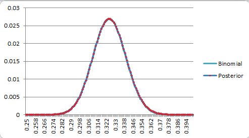
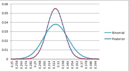
They overlap so closely you can’t even see the other line.  Going closer to the edge, we get, for 275 and 260 observed successes,

At 275, we get a posterior SD of .13 vs the binomial .14, and at 260, we start to break the thing, capping how far to the left the posterior can go, and *still* get a posterior SD of .11 vs .14.  What’s going on here is that the weight for a posterior value is the prior-weighted probability that that value (say, .320) produces an observation of .325 in N attempts, while the binomial bagging weight at that point is the probability that .325 produces an observation of .320 in N attempts.  These aren’t the same, but under a lot of circumstances, they’re pretty damn close, and as N grows, and the numbers that take the place of .320 and .325 in the meat of the distributions get closer and closer together, the posterior converges to the same normal that describes the binomial bagging.  Bayesian CLT meets normal CLT.

When the binomial bagging variance starts dropping well below the prior population variance, this convergence starts to happen enough to where the numbers can loosely be called “close” for most observed success rates, and that transition point happens to come out around a full season of somewhat regressed observation of baseball talent. In the example above, the prior population SD was 0.043 and the binomial variance was 0.014, so it converged excellently until we ran too close to the edge of the prior.  It’s never always going to work, because a low end talent can get unlucky, or a high end talent can get lucky, and observed performance can be more extreme than the talent distribution (super-easy in small samples, still happens in seasonal ones) but for everybody in the middle, it works out great.

Let’s make the priors more obnoxious and see how well this works- this is with a triangle distribution, max weight at .250 straight line down to a 0 weight at .400.


The left-weighted prior shifts the means, but the standard deviations are obviously about the same again here.  Let’s up the difficulty even more, starting with a N(.325,.020) prior (0.020 standard deviation), which is pretty close to the actual mean/SD wOBA talent distribution among position players (that distribution is left-weighted like the triangle too, but we already know that doesn’t matter much for the SD)

Even now that the bagging distributions are *completely* wrong and we’re using observations almost 2 SD out, the standard deviations are still .014-.015 bagging and .012 for the posterior.  Observing 3 SD out isn’t significantly worse.  The prior population SD was 0.020, and the binomial bagging variance was 0.014, so it was low enough that we were close to converging when the observation was in the bulk of the distribution but still nowhere close when we were far outside, although the SDs of the two were still in the ballpark everywhere.

Using only 500 observations on the N(.325,.020) prior isn’t close to enough to pretend there’s convergence even when observing in the bulk.

325500pa

The posterior has narrowed to a SD of .014 (around 9 points of wRC+ if we assume this is wOBA and treat wOBA like a Bernoulli, which is handwavy close enough here), which is why I said above that high-single-digits was “right”, but the binomial variance is still at .021, 50% too high.  The regression in DRC+ tightens up the tails compared to “binomial wOBA”, and it happens to come out to around a reasonable SD after a full season.

Just to be clear, the bagging numbers are always wrong and logically unjustified here, but they’re a hackjob that happens to be “close” a lot of the time when working with the equivalent of full-season DRC+ numbers (or more).  Before that point, when the binomial bagging variance is higher than the completely naive population variance (the mechanism for DRC+ reporting SDs in the 70s, 30s, or whatever for partial seasons), the bagging procedure isn’t close at all.  This is just another example of DRC+ doing nonsense that looks like baseball analysis to produce a number that looks like a baseball stat, sometimes, if you don’t look too closely.


Revisiting the DRC+ team switcher claim

The algorithm has changed a fair bit since I investigated that claim- at the least, it’s gotten rid of most of its park factor and regresses (effectively) less than it used to.  It’s not impossible that it could grade out differently now than it did before, and I told somebody on twitter that I’d check it out again, so here we are.  First of all, let’s remind everybody what their claim is.  From https://www.baseballprospectus.com/news/article/45383/the-performance-case-for-drc/, Jonathan Judge says:


Table 2: Reliability of Team-Switchers, Year 1 to Year 2 (2010-2018); Normal Pearson Correlations[3]

Metric Reliability Error Variance Accounted For
DRC+ 0.73 0.001 53%
wOBA 0.35 0.001 12%
wRC+ 0.35 0.001 12%
OPS+ 0.34 0.001 12%
OPS 0.33 0.002 11%
True Average 0.30 0.002 9%
AVG 0.30 0.002 9%
OBP 0.30 0.002 9%

With this comparison, DRC+ pulls far ahead of all other batting metrics, park-adjusted and unadjusted. There are essentially three tiers of performance: (1) the group at the bottom, ranging from correlations of .3 to .33; (2) the middle group of wOBA and wRC+, which are a clear level up from the other metrics; and finally (3) DRC+, which has almost double the reliability of the other metrics.

You should pay attention to the “Variance Accounted For” column, more commonly known as r-squared. DRC+ accounts for over three times as much variance between batters than the next-best batting metric. In fact, one season of DRC+ explains over half of the expected differences in plate appearance quality between hitters who have switched teams; wRC+ checks in at a mere 16 percent.  The difference is not only clear: it is not even close.

Let’s look at Predictiveness.  It’s a very good sign that DRC+ correlates well with itself, but games are won by actual runs, not deserved runs. Using wOBA as a surrogate for run-scoring, how predictive is DRC+ for a hitter’s performance in the following season?

Table 3: Reliability of Team-Switchers, Year 1 to Year 2 wOBA (2010-2018); Normal Pearson Correlations

Metric Predictiveness Error
DRC+ 0.50 0.001
wOBA 0.37 0.001
wRC+ 0.37 0.002
OPS+ 0.37 0.001
OPS 0.35 0.002
True Average 0.34 0.002
OBP 0.30 0.002
AVG 0.25 0.002

If we may, let’s take a moment to reflect on the differences in performance we see in Table 3. It took baseball decades to reach consensus on the importance of OBP over AVG (worth five points of predictiveness), not to mention OPS (another five points), and finally to reach the existing standard metric, wOBA, in 2006. Over slightly more than a century, that represents an improvement of 12 points of predictiveness. Just over 10 years later, DRC+ now offers 13 points of improvement over wOBA alone.


Reading that, you’re pretty much expecting a DIPS-level revelation.  So let’s see how good DRC+ really is at predicting team switchers.  I put DRC+ on the wOBA scale, normalized each performance to the league-average wOBA that season (it ranged from .315 to .326), and measured the mean absolute error (MAE) of wOBA projections for the next season, weighted by the harmonic mean of the PAs in each season.  DRC+ had a MAE of 34.2 points of wOBA for team-switching position players.  Projecting every team-switching position player to be exactly league average had a MAE of 33.1 points of wOBA.  That’s not a mistake.  After all that build-up, DRC+ is literally worse at projecting team-switching position players than assuming that they’re all league average.

If you want to say something about pitchers at the plate…
i-dont-think-so-homey-dont-play-that


Even though Jonathan Judge felt like calling me a total asshole incompetent troll last night, I’m going to show how his metric could be not totally awful at this task if it were designed and quality-tested better.  As I noted yesterday, DRC+’s weightings are *way* too aggressive on small numbers of PAs.  DRC+ shouldn’t *need* to be regressed after the fact- the whole idea of the metric is that players should only be getting credit for what they’ve shown they deserve (in the given season), and after a few PAs, they barely deserve anything, but DRC+ doesn’t grasp that at all and its creator doesn’t seem to realize or care that it’s a problem.

If we regress DRC+ after the fact to see what happens in an attempt to correct that flaw, it’s actually not a dumpster fire.  All weightings are harmonic means of the PAs.  Every position player pair of consecutive 2010-18 seasons with at least 1 PA in each is eligible.  All tables are MAEs in points of wOBA trying to project year T+1 wOBA..

First off, I determined the regression amounts for DRC+ and wOBA to minimize the weighted MAE for all position players, and that came out to adding 416 league average PAs for wOBA and 273 league average PAs for DRC+.  wOBA assigns 100% credit to the batter.  DRC+ *still* needs to be regressed 65% as much as wOBA.  DRC+ is ridiculously overaggressive assigning “deserved” credit.

Table 1.  MAEs for all players

lgavg raw DRC+ raw wOBA reg wOBA reg DRC+
33.21 31.00 33.71 29.04 28.89

Table 2. MAEs for all players broken down by year T PAs

Year T PA lgavg raw DRC+ raw wOBA reg wOBA reg DRC+ T+1 wOBA
1-99 PAs 51.76 48.84 71.82 49.32 48.91 0.284
100-399 PA 36.66 36.64 40.16 34.12 33.44 0.304
400+ PA 30.77 27.65 28.97 25.81 25.91 0.328

Didn’t I just say DRC+ had a problem with being too aggressive in small samples?  Well, this is one area where that mistake pays off- because the group of hitters who have 1-99 PA over a full season are terrible, being overaggressive crediting their suckiness pays off, but if you’re in a situation like now, where the real players instead of just the scrubs and callups have 1-99 PAs, being overaggressive is terribly inaccurate.  Once the population mean approaches league-average quality, the need for- and benefit of- regression is clear. If we cheat and regress each bucket to its population mean, it’s clear that DRC+ wasn’t actually doing anything special in the low-PA bucket, it’s just that regression to 36 points of wOBA higher than the mean wasn’t a great corrector.

Table 3. (CHEATING) MAEs for all players broken down by year T PAs, regressed to their group means (same regression amounts as above).

Year T PA lgavg raw DRC+ raw wOBA reg wOBA reg DRC+ T+1 wOBA
1-99 PAs 51.76 48.84 71.82 46.17 46.30 0.284
100-399 PA 36.66 36.64 40.16 33.07 33.03 0.304
400+ PA 30.77 27.65 28.97 26.00 25.98 0.328

There’s very little difference between regressed wOBA and regressed DRC+ here.  DRC+ “wins” over wOBA by 0.00015 wOBA MAE over all position players, clearly justifying the massive amount of hype Jonathan Judge pumped us up with.  If we completely ignore the trash position players and only optimize over players who had 100+PA in year T, then the regression amounts increase slightly- 437 PA for wOBA and 286 for DRC+, and we get this chart:

Table 4. MAEs for all players broken down by year T PAs, optimized on 100+ PA players

Year T PA lgavg raw DRC+ raw wOBA reg wOBA reg DRC+ T+1 wOBA
100+ PA 32.55 30.37 32.36 28.32 28.19 0.321
100-399 PA 36.66 36.64 40.16 34.12 33.45 0.304
400+ PA 30.77 27.65 28.97 25.81 25.91 0.328

Nothing to see here either, DRC+ with a 0.00013 MAE advantage again.  Using only 400+PA players to optimize over only changes the DRC+ entry to 25.90, so regressed wOBA wins a 0.00009 MAE victory here.

In conclusion, regressed wOBA and regressed DRC+ are so close that there’s no meaningful difference, and I’d grade DRC+ a microscopic winner.  Raw DRC+ is completely awful in comparison, even though DRC+ shouldn’t need anywhere near this amount of extra regression if it were working correctly to begin with.

I’ve slowrolled the rest of the team-switcher nonsense.  It’s not very exciting either.  I defined 3 classes of players, Stay = played both years entirely for the same team, Switch = played year T entirely for 1 team and year T+1 entirely for 1 other team, Midseason = switched midseason in at least one of the years.

Table 5. MAEs for all players broken down by stay/switch, any number of year T PAs

stay/

switch

lgavg raw DRC+ raw wOBA reg wOBA reg DRC+ T+1 wOBA
stay 33.21 29.86 32.19 27.91 27.86 0.325
switch 33.12 34.20 37.89 31.57 31.53 0.312
mid 33.29 33.01 36.47 31.67 31.00 0.305
sw+mid 33.21 33.60 37.17 31.62 31.26 0.309

It’s the same story as before.  Raw DRC+ sucks balls at projecting T+1 wOBA and is actually worse than “everybody’s league average” for switchers, regressed DRC+ wins a microscopic victory over regressed wOBA for stayers and switchers.  THERE’S (STILL) LITERALLY NOTHING TO THE CLAIM THAT DRC+, REGRESSED OR OTHERWISE, IS ANYTHING SPECIAL WITH RESPECT TO PROJECTING TEAM SWITCHERS.  These are the same conclusions I found the first time I looked, and they still hold for the current version of the DRC+ algorithm.


DRC+ weights TTO relatively *less* than BIP after 10 games than after a full season

This is a cut-out from a longer post I was running some numbers for, but it’s straightforward enough and absurd enough that it deserves a standalone post.  I’d previously looked at DRAA linear weights and the relevant chart for that is reproduced here.  This is using seasons with 400+PA.

relative to average PA 1b 2b 3b hr bb hbp k bip out
old DRAA 0.22 0.38 0.52 1.16 0.28 0.24 -0.24 -0.13
new DRAA 0.26 0.45 0.62 1.17 0.26 0.30 -0.24 -0.15
wRAA 0.44 0.74 1.01 1.27 0.27 0.33 -0.26 -0.27


I reran the same analysis on 2019 YTD stats, with all position players and with a 25 PA minimum, and these are the values I recovered.  Full year is the new DRAA row above, and the percentages are the percent relative to those values.

1b 2b 3b hr bb hbp k BIP out
YTD 0.13 0.21 0.29 0.59 0.11 0.08 -0.14 -0.10
min 25 PA 0.16 0.27 0.37 0.63 0.12 0.09 -0.15 -0.11
Full Year 0.26 0.45 0.62 1.17 0.26 0.30 -0.24 -0.15
YTD %s 48% 47% 46% 50% 41% 27% 57% 64%
min 25PA %s 61% 59% 59% 54% 46% 30% 61% 74%

So.. this is quite something.  First of all, events are “more-than-half-deserved” relative to the full season after only 25-50 PA.  There’s no logical or mathematical reason for that to be true, for any reasonable definition of “deserved”, that quickly.  Second, BIP hits are discounted *LESS* in a small sample than walks are, and BIP outs are discounted *LESS* in a small sample than strikeouts are.  The whole premise of DRC+ is that TTO outcomes belong to the player more than the outcomes of balls in play, and are much more important in small samples, but here we are, with small samples, and according to DRC+, the TTO OUTCOMES ARE RELATIVELY LESS IMPORTANT NOW THAN THEY ARE AFTER A FULL SEASON.  Just to be sure, I reran with wRAA and extracted almost the exact same values as chart 1, so there’s nothing super weird going on here.  This is complete insanity- it’s completely backwards from what’s actually true, and even to what BP has stated is true.  The algorithm has to be complete nonsense to “come to that conclusion”.

Reading the explanation article, I kept thinking the same thing over and over.  There’s no clear logical or mathematical justification for most steps involved, and it’s just a pile of junk thrown together and tinkered with enough to output something resembling a baseball stat most of the time if you don’t look too closely. It’s not the answer to any articulable, well-defined question.  It’s not a credible run-it-back projection (I’ll show that unmistakably in the next post, even though it’s already ruled out by the.. interesting.. weightings above).

Whenever a hodgepodge model is thrown together like DRC+ is, it becomes difficult-to-impossible to constrain it to obey things that you know are true.  At what point in the process did it “decide” that TTO outcomes were relatively less important now?  Probably about 20 different places where it was doing nonsense-that-resembles-baseball-analysis and optimizing functions that have no logical link to reality.  When it’s failing basic quality testing- and even worse, when obvious quality assurance failures are observed and not even commented on (next post)- it’s beyond irresponsible to keep running it out as something useful solely on the basis of a couple of apples-to-oranges comparisons on rigged tests.


A new look at the TTOP, plus a mystery

I had the bright idea to look at the familiarity vs. fatigue TTOP debate, which has MGL on the familiarity side and Pizza Cutter on the fatigue side, by measuring performance based on the number of pitches the batter had seen previously and the number of pitches that the pitcher had thrown to other players in between the PAs in question.  After all, a fatigue effect on the TTOP shouldn’t be from “fatigue”, but “relative change in fatigue”, and that seemed like a cleaner line of inquiry than just total pitch count.  Not a perfect one, but one that should pick up a signal if it’s there.  Then I realized MGL had already done the first part of that experiment, which I’d somehow completely forgotten even though I’d read that article and the followup around the time they came out.  Oh well.  It never hurts to redo the occasional analysis to make sure conclusions still hold true.

I found a baseline 15 point PA1-PA2 increase as well as another 15 point PA2-PA3 increase.  I didn’t bother looking at PA4+ because the samples were tiny and usage is clearly changing.  In news that should be surprising to absolutely nobody reading this, PAs given to starters are on the decline overall and the number of PA4+ is absolutely imploding lately.

Season Total PAs 1st TTO 2nd 3rd 4th 5th
2008 116960 42614 40249 30731 3359 7
2009 116963 42628 40186 30736 3406 7
2010 119130 42621 40457 32058 3990 4
2011 119462 42588 40458 32333 4080 3
2012 116637 42506 40336 30741 3050 4
2013 116872 42570 40422 31026 2851 3
2014 117325 42612 40618 31235 2856 4
2015 114797 42658 40245 29580 2314 0
2016 112480 42461 40128 28193 1698 0
2017 110195 42478 39912 26476 1329 0
2018 106051 42146 38797 24057 1051 0

Looking specifically at PA2 based on the number of pitches seen in PA1, I found a more muted effect than MGL did using 2008-2018 data with pitcher-batters and IBB/sac-bunt PAs removed.  My data set consisted of (game,starter,batter,pa1,pa2,pa3) rows where the batter had to face the starter at least twice, the batter wasn’t the pitcher, and any ibb/sac bunt PA in the first three trips disqualified the row (pitch counts do include pitches to non-qualified rows where relevant).  For a first pass, that seemed less reliant on individual batter-pitcher projections than allowing each set of PAs to be biased by crap hitters sac-bunting and good hitters getting IBBd would have been.

Pitches in PA 1 wOBA in PA 2 Expected** n
1 0.338 0.336 39832
2 0.341 0.335 69761
3 0.336 0.335 79342
4 0.334 0.335 82847
5 0.339 0.337 74786
6 0.347 0.338 51374
7+ 0.349 0.337 36713

MGL found a 15 point bonus for seeing 5+ pitches the first time up (on top of the baseline 10 he found), but I only get about an 11 point bonus on 6+ pitches and 3 points of that are from increased batter/worse pitcher quality (“Expected” is just a batter/pitcher quality measure, not an actual 2nd TTO prediction). The SD of each bucket is on the order of .002, so it’s extremely likely that this effect is real, and also likely that it’s legitimately smaller than it was in MGL’s dataset, assuming I’m using a similar enough sampling/exclusion method, which I think I am.  It’s not clear to me that that has to be an actual familiarity effect, because I would naively expect to see more of a monotonic increase throughout the number of pitches seen instead of the J-curve, but the buckets have just enough noise that the J-curve might simply be an artifact anyway, and short PAs are an odd animal in their own right as we’ll see later.

Doing the new part of the analysis, looking at the wOBA difference in PA2-PA1 based on the number of intervening pitches to other batters, I wasn’t sure I was going to find much fatigue evidence early in the game, but as it turns out, the relationship is clear and huge.

intervening pitches wOBA PA2-PA1 vs base .015 TTOP n
<=20 -0.021 -0.036 9476
21 -0.005 -0.020 5983
22 -0.005 -0.020 8652
23 0.004 -0.011 11945
24 0.000 -0.015 15683
25 0.004 -0.011 19592
26 0.001 -0.014 23057
27 0.005 -0.010 26504
28 0.009 -0.006 29690
29 0.015 0.000 31453
30 0.021 0.006 32356
31 0.014 -0.001 32250
32 0.020 0.005 30723
33 0.018 0.003 28390
34 0.027 0.012 25745
35 0.028 0.013 22407
36 0.023 0.008 18860
37 0.030 0.015 15429
38 0.025 0.010 12420
39 0.012 -0.003 9558
40 0.045 0.030 7362
41-42 0.032 0.017 9241
43+ 0.027 0.012 7879

That’s a monster effect, 2 points of TTOP wOBA per intervening pitch with an unmistakable trend.  Jackpot.  Hareeb’s a genius.  That’s big enough that it should result in actionable game situations all the time.  Let’s look at it in terms of actual 2nd time wOBAs (quality-adjusted).

intervening pitches PA2 wOBA (adj)
<=20 0.339
21 0.346
22 0.343
23 0.344
24 0.340
25 0.341
26 0.339
27 0.339
28 0.337
29 0.340
30 0.341
31 0.338
32 0.347
33 0.336
34 0.345
35 0.344
36 0.336
37 0.340
38 0.328
39 0.335
40 0.340
41-42 0.338
43+ 0.344

Wait what??!?!? Those look almost the same everywhere.  If you look closely, the higher-pitch-count PA2 wOBAs even average out to be a tad (4-5 points) *lower* than the low-pitch-count ones (and the same for PA1-PA3, though that needs a closer look). If I didn’t screw anything up, that can only mean..

intervening pitches PA1 wOBA (adj)
<=20 0.361
21 0.351
22 0.348
23 0.339
24 0.340
25 0.336
26 0.338
27 0.335
28 0.327
29 0.325
30 0.320
31 0.325
32 0.326
33 0.319
34 0.318
35 0.316
36 0.312
37 0.311
38 0.303
39 0.323
40 0.295
41-42 0.306
43+ 0.318

Yup.  The number of intervening pitches TO OTHER BATTERS between somebody’s first and second PA has a monster “effect on” the PA1 wOBA.  I started hand-checking more rows of pitch counts and PA results, you name it.  I couldn’t believe this was possibly real.  I asked one of my friends to verify that for me, and he did, and I mentioned the “effect” to Tango and he also observed the same pattern.  This is actually real.  It also works the same way between PA2 and PA3. I couldn’t keep looking at other TTOP stuff with this staring me in the face, so the rest of this post is going down this rabbit hole showing my path to figuring out what was going on.  If you want to stop here and try to work it out for yourself, or just think about it for awhile before reading on, I thought it was an interesting puzzle.

It’s conventional sabermetric wisdom that the box-score-level outcome of one PA doesn’t impart giant predictive effects, but let’s make sure that still holds up.

Reached base safely in PA1 PA2 wOBA (adj) Batter quality Pitcher quality
Yes 0.348 0.338 0.339
No 0.336 0.334 0.336

That’s a 12 point effect, but 7 of it is immediately explained by talent differences, and given the plethora of other factors I didn’t control for, all of which will also skew hitter-friendly like the batter and pitcher quality did, there’s just nothing of any significance here.    Maybe the effect is shorter-term than that?

Reached base safely in PA1 Next batter wOBA (adj) Next batter quality Pitcher quality
Yes 0.330 0.337 0.339
No 0.323 0.335 0.336

A 7 point effect where 5 is immediately explained by talent.  Also nothing here.  Maybe there’s some effect on intervening pitch count somehow?

Reached base safely in PA1 Average intervening pitches intervening wOBA (adj)
Yes 30.58 0.3282
No 30.85 0.3276

Barely, and the intervening batters don’t even hit quite as well as expected given that we know the average pitcher is 3 points worse in the Yes group.  Alrighty then.  There’s a big “effect” from intervening pitch count on PA1 wOBA, but PA1 wOBA has minimal to no effect on intervening pitch count, intervening wOBA, PA2 wOBA, or the very next hitter’s wOBA.  That’s… something.

In another curious note to this effect,

intervening pitches intervening wOBA (adj)
<=20 0.381
21 0.373
22 0.363
23 0.358
24 0.351
25 0.344
26 0.343
27 0.335
28 0.333
29 0.328
30 0.324
31 0.322
32 0.319
33 0.316
34 0.316
35 0.312
36 0.310
37 0.310
38 0.307
39 0.311
40 0.308
41-42 0.309
43+ 0.311

Another monster correlation, but that one has a much simpler explanation: short PAs show better results for hitters

Pitches in PA wOBA (adj) n
1 0.401 133230
2 0.383 195614
3 0.317 215141
4 0.293 220169
5 0.313 198238
6 0.328 133841
7 0.347 57396
8+ 0.369 37135

Throw a bunch of shorter PAs together and you get the higher aggregate wOBA seen in the table right above this one. It seems like the PA length effect has to be a key.  Maybe there’s a difference in the next batter’s pitch distribution depending on PA1?

Pitches in PA Fraction of PA after reached base Fraction of PA  after out wOBA after reached base wOBA after out OBP after reached base OBP after out
1 0.109 0.089 0.394 0.402 0.362 0.359
2 0.164 0.158 0.375 0.376 0.348 0.343
3 0.183 0.182 0.308 0.303 0.284 0.278
4 0.186 0.191 0.289 0.276 0.299 0.281
5 0.165 0.174 0.311 0.301 0.339 0.323
6 0.112 0.120 0.323 0.32 0.367 0.360
7 0.049 0.052 0.346 0.339 0.393 0.386
8+ 0.032 0.034 0.356 0.36 0.401 0.405

Now we’re cooking with gas.  That’s a huge likelihood ratio difference for 1-pitch PAs, and using our PA1 OBP of about .324, we’d expect to see a PA1 OBP of .370 given a 1-pitch PA followup, which is exactly what we get, and the longer PAs are more weighted to previous outs because of the odds ratio favoring outs after we get to 4 pitches.

Next PA pitches This PA1 OBP This PA1 wOBA
1 0.370 0.373
2 0.333 0.332
3 0.326 0.325
4 0.319 0.318
5 0.313 0.313
6 0.311 0.313
7 0.314 0.310
8 0.313 0.309

It seems like this should be a big cause of the observed effect. I used the 2nd/6th and 3rd/7th columns from two tables up to create a process that would “play through” the next 8 PAs starting after an out or a successful PA, deciding on the number of pitches and then whether it was an out or not based on the average values.  Then I calculated the expected OBP for PA1 based on the likelihood ratios of each number of total pitches to happen (the same way I got .370 from the odds ratio for a 1-pitch followup PA).

As it turns out, that effect alone can reproduce the shape and a little over half the spread

intervening pitches PA1 OBP (adj) model PA1 OBP
<=20 0.366 0.340
21 0.351 0.336
22 0.349 0.329
23 0.339 0.338
24 0.343 0.332
25 0.336 0.328
26 0.335 0.327
27 0.335 0.328
28 0.328 0.328
29 0.325 0.326
30 0.320 0.326
31 0.324 0.323
32 0.324 0.323
33 0.318 0.321
34 0.318 0.324
35 0.317 0.323
36 0.312 0.317
37 0.313 0.318
38 0.307 0.320
39 0.320 0.310
40 0.300 0.317
41-42 0.308 0.309
43+ 0.320 0.317

and that simple model is deficient at a number of things (correlations longer than 1 pa, different batters, base-out states, etc).  I don’t know everything that’s causing the effect, but I have a good chunk of it, and that reverse pitch count selection bias isn’t something I’ve ever seen mentioned before.  This is also a caution to any kind of analysis involving pitch counts to be very careful to avoid walking into this effect.


2/05/19 DRC+ update- some partial fixes, some new problems

BP released an update to DRC+ yesterday purporting to fix/improve several issues that have been raised on this blog.  One thing didn’t change at all though- DRC+ still isn’t a hitting metric.  It still assigns pitchers artificially low values no matter how well they hit, and the areas of superior projection (where actually true) are largely driven by this.  The update claimed two real areas of improvement.

Valuation

The first is in treating outlier players.  As discussed in C’mon Man- Baseball Prospectus DRC+ Edition by treating player seasons individually and regressing them, instead of treating careers, DRC+ will continually fail to realize that outliers are really outliers. Their fix is, roughly, to make a prior distribution based on all player performances in surrounding years, and hopefully not regress the outliers as much because it realizes something like them might actually exist.  That mitigates the problem a little, sometimes, but it’s still an essentially random fix.  Some cases previously mentioned look better, and others, like Don Kessinger vs. Larry Bowa still don’t make any sense at all.  They’re very similar offensive players, in the same league, overlapping in most of their careers, and yet Kessinger gets wRC-DRC bumped from 72 to 80 while Bowa only goes from 70 to 72, even though Kessinger was *more* TTO-based.

To their credit- or at least to credit their self-awareness, they seem to know that their metric is not reliable at its core for valuation.  Jonathan Judge says

“As always, you should remember that, over the course of a career, a player’s raw stats—even for something like batting average—tend to be much more informative than they are for individual seasons. If a hitter consistently seems to exceed what DRC+ expects for them, at some point, you should feel free to prefer, or at least further account for, the different raw results.”

Roughly translated, “Regressed 1-year performance is a better estimation of talent that 1-year raw performance, but ignoring the rest of a player’s career and re-estimating talent 1 year at a time can cause discrepancies, and if it does, trust the career numbers more.” I have no argument with that.  The question remains how BP will actually use the stat- if we get more fluff pieces on DRC+ outliers who are obviously just the kind career discrepancies Judge and I talked about, that’s bad.  If it is mainly used to de-luck balls in play for players who haven’t demonstrated that they deserve much outlier consideration, that’s basically fine and definitely not the dumbest thing I’ve seen lately.


This, on the other hand, well might be.

NAME YEAR PA BB DRC+ DRC+ SD DRAA
Mark Melancon 2011 1 1 -3 2 -0.1
Dan Runzler 2011 1 1 -17 2 -0.1
Matt Guerrier 2011 1 1 -13 2 -0.1
Santiago Casilla 2011 1 1 -12 2 -0.1
Josh Stinson 2011 1 1 -15 2 -0.1
Jose Veras 2011 1 1 -14 2 -0.1
Javy Guerra 2011 1 1 -15 2 -0.1
Joey Gathright 2011 1 1 81 1 0

Not just the blatant cheating (Gathright is the only position player on the list), but the DRC+ SDs make no sense.  Based on one identical PA, DRC+ claims that there’s a 1 in hundreds of thousands chance that Runzler is a better hitter than Melancon and also assigns negative runs to a walk because a pitcher drew it.  The DRC+ SDs were pure nonsense before, but now they’re a new kind of nonsense. These players ranged from 9-31 SD in the previous iteration of DRC+, and while the low end of that was still certainly too low, SDs of 1-2 are beyond absurd, and the fact that they’re that low *only for players with almost no PAs* is a huge red flag that something inside the black box is terribly wrong.  Tango recently explored the SD of wRC+/WAR and found that the SDs should be similar for most players with the same number of PA.  DRC+ SDs done correctly could legitimately show up as slightly lower, because they’re the SD of a regressed stat, but that’s with an emphasis on slightly.  Not SDs of 1 or 2 for anybody, and not lower SDs for pitchers and part-time players who aren’t close to a season full of PAs.

Park Adjustments

I’d observed before that DRC+ still contains a lot of park factor and they’ve taken steps to address this.  They adjusted Colorado hitters more in this iteration while saying there wasn’t anything wrong with their previous park factors.  I’m not sure exactly how that makes sense, unless they just weren’t correcting for park factor before, but they claim to be park-isolated now and show a regression against their park factors to prove it.  Of course the key word in that claim is THEIR park factors.  I reran the numbers from the linked post with the new DRC+s, and while they have made an improvement, they’re still correlated to both Fangraphs park factor and my surrounding-years park factor estimate at the r=0.17-0.18 level, with all that entails (still overrating Rockies hitters, for one, just not by as much).